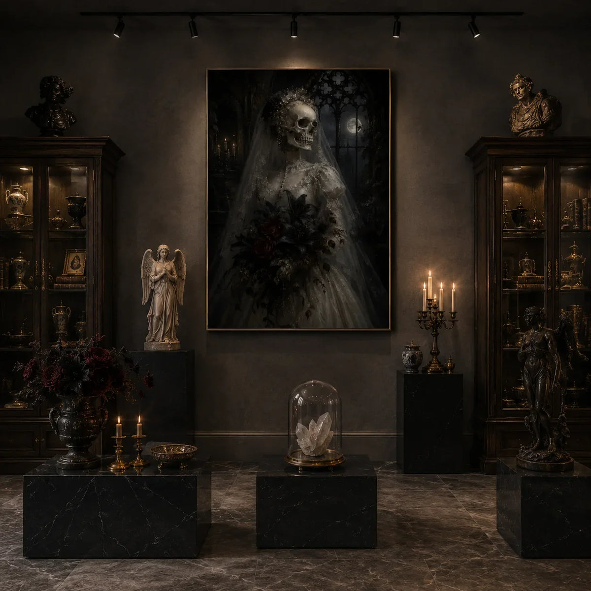

How to Choose Wall Art Colors That Match Your Home Decor
Choosing a painting for your home is not only about finding artwork you love. Color plays an important role in determining whether a painting feels naturally connected to the room or visually disconnected from everything around it.
But there is one important misconception:
Your wall art does not need to perfectly match your furniture.
In fact, some of the most beautiful interiors use artwork to introduce contrast, depth, and unexpected color.
The goal is not to make the sofa, rug, curtains, and painting the same color. The goal is to create a visual relationship between them.
A carefully chosen hand-painted oil painting can connect different colors in a room, introduce warmth into a neutral interior, add contrast to white walls, or become the focal point that gives the entire space personality.
This guide explains how to choose wall art colors for different furniture, wall colors, and interior styles.
Quick Answer: Should Wall Art Match Your Furniture?
No. Wall art does not need to match your furniture exactly.
Instead, artwork should complement the room.
A good painting usually does one or more of these things:
- Repeats one or two existing colors
- Introduces a complementary color
- Creates contrast
- Adds warmth
- Adds depth
- Connects different furniture colors
- Creates a focal point
For example, if your living room has a cream sofa, walnut furniture, and olive green pillows, the painting could contain beige, brown, olive, black, or muted gold.
It does not need to contain all of these colors.
Even one subtle color connection can make the artwork feel intentional.
1. Start with the Room, Not the Painting
Before choosing artwork, look at the room as a whole.
Identify the main colors already present.
These usually come from:
- Walls
- Sofa
- Bed
- Rug
- Curtains
- Flooring
- Wood furniture
- Accent chairs
- Pillows
- Lighting
- Decorative objects
Try to identify approximately three dominant color groups.
For example:
Cream + walnut brown + olive green
or:
Warm white + beige + black
or:
Gray + natural wood + dusty blue
Once you understand the room palette, choosing artwork becomes much easier.
You can either select art that harmonizes with these colors or deliberately introduces contrast.
2. What Color Wall Art Goes with a Beige Sofa?
Beige sofas are extremely versatile because they work with both warm and cool artwork.
For a soft, sophisticated look, choose:
- Cream
- Taupe
- Brown
- Warm gray
- Ivory
- Sand
For stronger contrast, choose:
- Black
- Charcoal
- Forest green
- Deep blue
- Burgundy
For a warmer organic look, choose:
- Terracotta
- Rust
- Olive
- Clay
- Muted gold
A beige sofa paired with a beige painting can look beautiful, but texture becomes important.
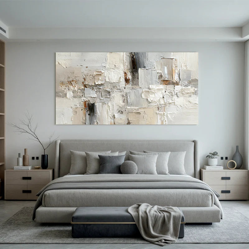
For example, a large beige textured oil painting can add depth through real brushstrokes and raised paint even when the colors remain subtle.
3. What Wall Art Looks Best with a Cream Sofa?
Cream furniture creates a soft and elegant foundation.
You can keep the room light with:
- Ivory artwork
- Beige abstract paintings
- Soft landscapes
- Pale blue
- Warm gray
Or create contrast with:
- Black
- Dark brown
- Olive green
- Navy blue
- Burgundy
A cream sofa with a black-and-beige abstract painting can create a sophisticated modern look.
A cream sofa with an earth-tone landscape creates a warmer, organic feeling.
A cream sofa with soft blue artwork can make the room feel calmer and lighter.
Because cream is neutral, the artwork can determine much of the room's personality.
4. What Wall Art Goes with a Gray Sofa?
Gray furniture works well with many colors, but the first step is determining whether the gray is warm or cool.
For cool gray sofas, consider:
- Blue
- White
- Charcoal
- Black
- Soft green
- Silver-gray
For warmer gray sofas, consider:
- Beige
- Taupe
- Cream
- Brown
- Rust
- Muted gold
If the entire room already contains a lot of gray, avoid automatically choosing another flat gray painting.
Instead, introduce warmth or texture.
A cream-and-brown abstract oil painting can prevent a gray living room from feeling too cold.
5. What Artwork Goes with Brown Furniture?
Brown furniture naturally works well with earth tones.
Good artwork colors include:
- Cream
- Beige
- Olive green
- Terracotta
- Black
- Rust
- Warm white
- Muted blue
- Gold
Dark walnut furniture can look particularly beautiful with lighter artwork because the contrast prevents the room from becoming visually heavy.
For example:
Dark walnut console + cream textured painting
creates a refined contrast.
Meanwhile:
Brown leather sofa + warm landscape painting
creates a richer, more traditional atmosphere.
6. What Wall Art Looks Good on White Walls?
White walls give you the most flexibility.
Almost any artwork can work on a white wall, but the choice changes the atmosphere dramatically.
For a minimalist look:
- Beige
- Cream
- Black and white
- Soft gray
For a warm look:
- Brown
- Terracotta
- Rust
- Gold
- Olive green
For a dramatic focal point:
- Black
- Navy
- Burgundy
- Forest green
- Strong multicolor artwork
For a calm look:
- Blue
- Sage green
- Soft landscape colors
- Neutral abstract paintings
White walls are essentially a blank canvas.
This means the painting can become one of the strongest color elements in the entire room.
7. What Artwork Goes with Beige or Cream Walls?
Beige and cream walls work particularly well with artwork that introduces subtle contrast.
If the painting is too close to the wall color and has little texture, it may disappear visually.
Good choices include:
- Brown and cream
- Black and beige
- Olive green
- Terracotta
- Warm gray
- Muted blue
- Dark earth tones
You can still use neutral artwork, but choose paintings with visible texture or stronger tonal variation.
This is where hand-painted textured wall art becomes especially useful.
Real paint texture creates light and shadow, allowing a neutral painting to remain visually interesting even against a neutral wall.
8. Should Wall Art Match the Rug?
Not exactly.
The rug and artwork should feel connected, but they do not need identical colors.
A useful approach is to repeat one secondary color.
For example:
If your rug contains:
cream + brown + muted blue
your painting might primarily be beige and cream with a small amount of blue.
That small connection can make the room feel cohesive.
Another approach is contrast.
A very neutral rug can support more colorful artwork.
A colorful patterned rug may work better with quieter wall art.
Think of the room as a balance:
If one element is visually busy, another can be calmer.
9. Should Wall Art Match the Curtains?
Again, exact matching is unnecessary.
Instead, consider color temperature.
If your curtains are warm beige linen, artwork with warm neutrals, earth tones, olive, brown, or muted gold will usually feel natural.
If your curtains are cool gray or blue, artwork with soft blues, gray, black, white, or cooler greens may work better.
You can also deliberately create contrast.
For example:
Cream curtains + deep blue painting
can create a beautiful focal point.
The important thing is that the combination feels intentional.
10. Should Artwork Match Throw Pillows?
Throw pillows are one of the easiest ways to connect artwork with furniture.
Because pillows are small and easy to change, they can repeat colors from the painting without making the room feel overly coordinated.
For example, imagine a painting containing:
- Beige
- Olive green
- Black
- Small touches of rust
You could use:
- Cream sofa
- Olive pillow
- Rust pillow
- Black lamp
Now the painting feels naturally integrated into the room.
This is a common interior styling technique because it creates subtle repetition.
11. How Many Colors Should Artwork Share with the Room?
There is no strict rule.
However, repeating one to three colors from the room is often enough to create visual harmony.
You do not need to match every color.
For example, if the room contains:
- Cream sofa
- Walnut table
- Black lamp
- Olive pillows
- Beige rug
the artwork could simply contain:
cream + brown + black
and still feel perfectly connected.
The goal is visual conversation, not duplication.
12. Should Wall Art Contrast with the Wall?
Sometimes, yes.
Contrast helps artwork stand out.
For example:
White wall → dark artwork
creates strong contrast.
Dark green wall → cream artwork
creates dramatic contrast.
Beige wall → black and cream painting
creates sophisticated contrast.
However, low-contrast styling can also look beautiful.
For example:
Cream wall → beige textured painting
creates a quiet luxury effect.
In this situation, texture becomes more important than color contrast.
Neither approach is automatically better.
Choose based on whether you want the artwork to feel like a strong focal point or a subtle part of the room.
13. Warm vs Cool Wall Art
Understanding color temperature can make choosing artwork much easier.
Warm Artwork
Common colors:
- Beige
- Cream
- Brown
- Rust
- Terracotta
- Gold
- Warm red
- Olive
Warm artwork often makes a room feel:
- Cozy
- Inviting
- Organic
- Comfortable
- Intimate
It works especially well with wood furniture and warm lighting.
Cool Artwork
Common colors:
- Blue
- Gray
- White
- Charcoal
- Cool green
- Soft lavender
Cool artwork often makes a room feel:
- Calm
- Clean
- Spacious
- Contemporary
- Peaceful
It works well in bedrooms, coastal homes, and modern interiors.
14. What Wall Art Colors Make a Room Look More Expensive?
There is no single “luxury color,” but sophisticated interiors often use controlled palettes rather than too many unrelated colors.
Popular combinations include:
Cream + black + brown
Beige + taupe + warm white
Ivory + olive + walnut
Cream + navy + brass
Brown + rust + muted gold
Black + white + natural wood
These combinations work because they create contrast while remaining visually balanced.
Texture also matters.
A simple beige hand-painted oil painting with rich texture can sometimes feel more luxurious than a highly colorful flat print.
Luxury often comes from:
material + scale + texture + restraint
rather than color alone.
15. Neutral Wall Art Does Not Have to Be Boring
Neutral artwork is sometimes misunderstood as plain.
But neutral paintings can contain tremendous visual depth.
The key is variation in:
- Texture
- Brushwork
- Shape
- Tonal contrast
- Composition
- Surface depth
A painting may use only cream, beige, brown, and black yet still feel dramatic.
This is why neutral hand-painted oil paintings work so well in modern interiors.
They provide visual interest without overwhelming the room.
16. Use Artwork to Introduce a New Accent Color
Artwork does not always need to follow the room.
Sometimes it can lead the room.
Imagine a neutral living room with:
- Cream sofa
- Beige rug
- Walnut table
- White walls
You could introduce an olive green painting.
Then repeat olive subtly through:
- One pillow
- A ceramic vase
- A plant
- A book cover
Now the painting becomes the starting point for a new accent color.
This is an excellent strategy if your room feels too neutral or unfinished.
17. Choosing Wall Art Colors by Interior Style
Organic Modern
Choose:
- Beige
- Brown
- Olive
- Cream
- Clay
- Black accents
Quiet Luxury
Choose:
- Ivory
- Taupe
- Warm gray
- Cream
- Muted brown
- Soft black
Minimalist
Choose:
- Black
- White
- Beige
- Gray
- Limited earth tones
Coastal
Choose:
- Blue
- White
- Sand
- Soft gray
- Muted green
Mid-Century Modern
Choose:
- Olive
- Mustard
- Rust
- Brown
- Cream
- Black
Contemporary Luxury
Choose:
- Black
- Cream
- Brown
- Deep green
- Burgundy
- Navy
- Metallic accents
18. Why Hand-Painted Art Works Especially Well with Interior Color
Color in a real painting behaves differently from color in a flat printed image.
Hand-painted oil paintings contain:
- Layered pigments
- Visible brushstrokes
- Surface texture
- Natural variation
- Different light reflections
Because of this, a beige hand-painted painting may contain many subtle tones rather than one flat beige color.
Under daylight, some areas may appear lighter.
Under warm evening lighting, other tones may become more visible.
This gives hand-painted wall art more visual depth and helps it interact naturally with the surrounding interior.
Common Wall Art Color Mistakes
Matching Everything Exactly
A beige sofa does not require a beige rug, beige curtains, beige painting, and beige pillows.
Without variation, the room can feel flat.
Ignoring Undertones
Warm beige and cool gray may clash even if both appear neutral.
Using Too Many Unrelated Colors
Too many colors can make a room feel visually chaotic.
Forgetting Texture
If the room is very neutral, texture becomes especially important.
Choosing Art Without Considering the Room
A painting may look beautiful online but feel completely different once placed beside your furniture.
Always consider the surrounding environment.
FAQ: Matching Wall Art with Home Decor
Should wall art match the sofa?
No. Wall art should complement the sofa rather than match it exactly. Repeating one or two colors is usually enough.
What color wall art goes with a beige sofa?
Cream, brown, taupe, black, olive green, terracotta, deep blue, and warm gray all work beautifully with beige sofas.
What wall art goes with white walls?
Almost any color works with white walls. Neutral artwork creates a calm look, while darker or colorful artwork creates a stronger focal point.
Should artwork match the rug?
It does not need to match exactly. Repeating one secondary color from the rug can help create visual harmony.
What color painting makes a living room look expensive?
Neutral combinations such as cream, black, brown, taupe, olive, and warm white often create sophisticated interiors, especially when combined with high-quality texture and proper scale.
Can I use colorful art in a neutral room?
Yes. A neutral room is an excellent background for colorful artwork. Repeat one or two colors from the painting elsewhere in the room to create balance.
Should wall art be lighter or darker than the wall?
Either can work. Darker artwork creates contrast, while similar tones create a softer and more subtle effect.
Final Thoughts
Choosing wall art colors is not about perfectly matching every object in your room.
The most beautiful interiors create relationships between colors.
Your painting can repeat a color from the sofa, connect with the rug, contrast with the wall, or introduce an entirely new accent color.
The key is balance.
When choosing a hand-painted oil painting, also consider texture, scale, composition, and lighting. Real brushstrokes and layered paint can add depth even when the color palette is simple.
At Ownanrat, our hand-painted oil paintings are designed to bring color, texture, and artistic character into modern interiors.
Your artwork does not need to match your room perfectly.
It should make the room feel more complete.